What is a credenza? We get that question a lot. Similar to a sideboard or buffet, the credenza is a piece of storage with doors and sometimes drawers. Like bookcases or coffee tables, credenzas can be styled again and again to keep things fresh.
We get it - that wide open credenza can be intimidating. How do you arrange everything without overdoing it? How do you keep your credenza looking stylish, while still being useful?
Take a deep breath because we've got your back. Keep on scrollin' for style tips from the Scoutpack and a peek at some of our favorite credenza LEWKS.
● ● ● ● ●


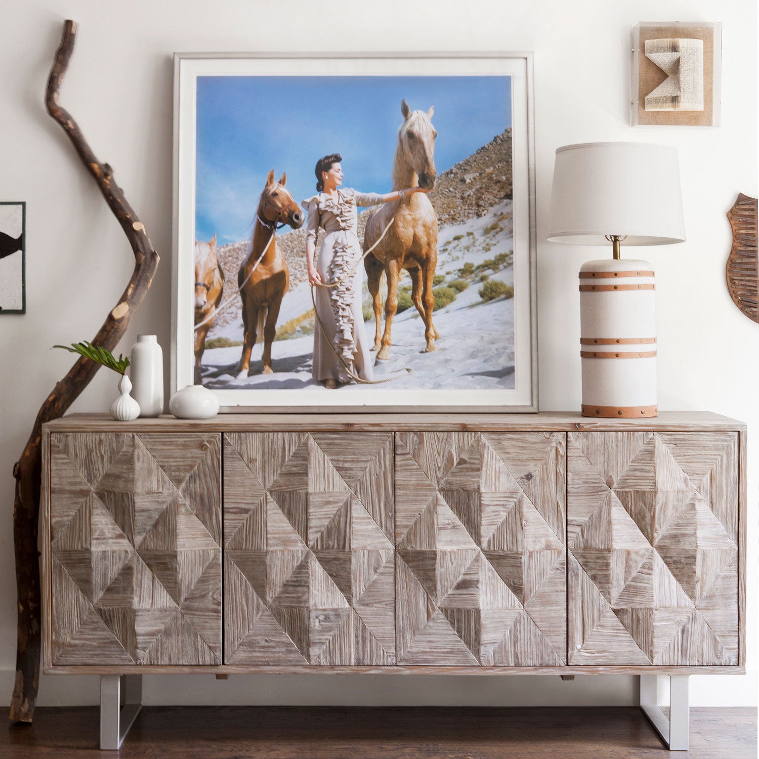
Have a stunning piece of art that you’re obsessed with? Create a seriously symmetrical look by framing it with matching lamps. Neutral tones allow the art to set the mood here, while smaller accents on the credenza keep things from being too matchy-matchy.
● ● ● ● ●


When curating a bright & punchy piece, embracing color theory is the way to go. Here, we paired reds with reds and whites with whites to create harmony throughout. A complimentary green plant brings the contrast.
● ● ● ● ●


Take inspiration from what’s already in your space. Lean into the pre-existing colors in the room. From lamps that match the staircase to wall art that pairs with the rug, the styling of this credenza plays off the styling of the rest of the room.
● ● ● ● ●


Color coordination is everything with this lavender look. Keeping it simple with minimal décor lets the violet vibes speak for themselves with this credenza. Pro tip: pairing pastel pieces with dark flooring allows everything to pop!
● ● ● ● ●


When in doubt—add some plants! Here, unique planters stand out against the clean white lacquer of the credenza. Stagger some wall art above a low piece to add some height and visual interest. PLUS, adding a shelf above your credenza makes switching out wall art a breeze.
● ● ● ● ●


Neutrals are the name of the game here. Eye-catching textures and patterns keep things lively and unique. The minimalist styling of this credenza means unique pieces and rare finds receive all the attention they deserve.
● ● ● ● ●


Monochromatic styling can be intimidating, so opt for softer shades for a less risky look. We love the sense of calm and serenity that this BLEWK brings to the table. White accents on the credenza make the space feel more open, while 3D wall art adds a sense of whimsy.
● ● ● ● ●


Curves and woodsy neutrals are the stars of the show here, so adding in a stack of colorful books creates contrast and draws the eye. Finishing the look off with mirrors adds dimension and an open feeling to the space.
● ● ● ● ●


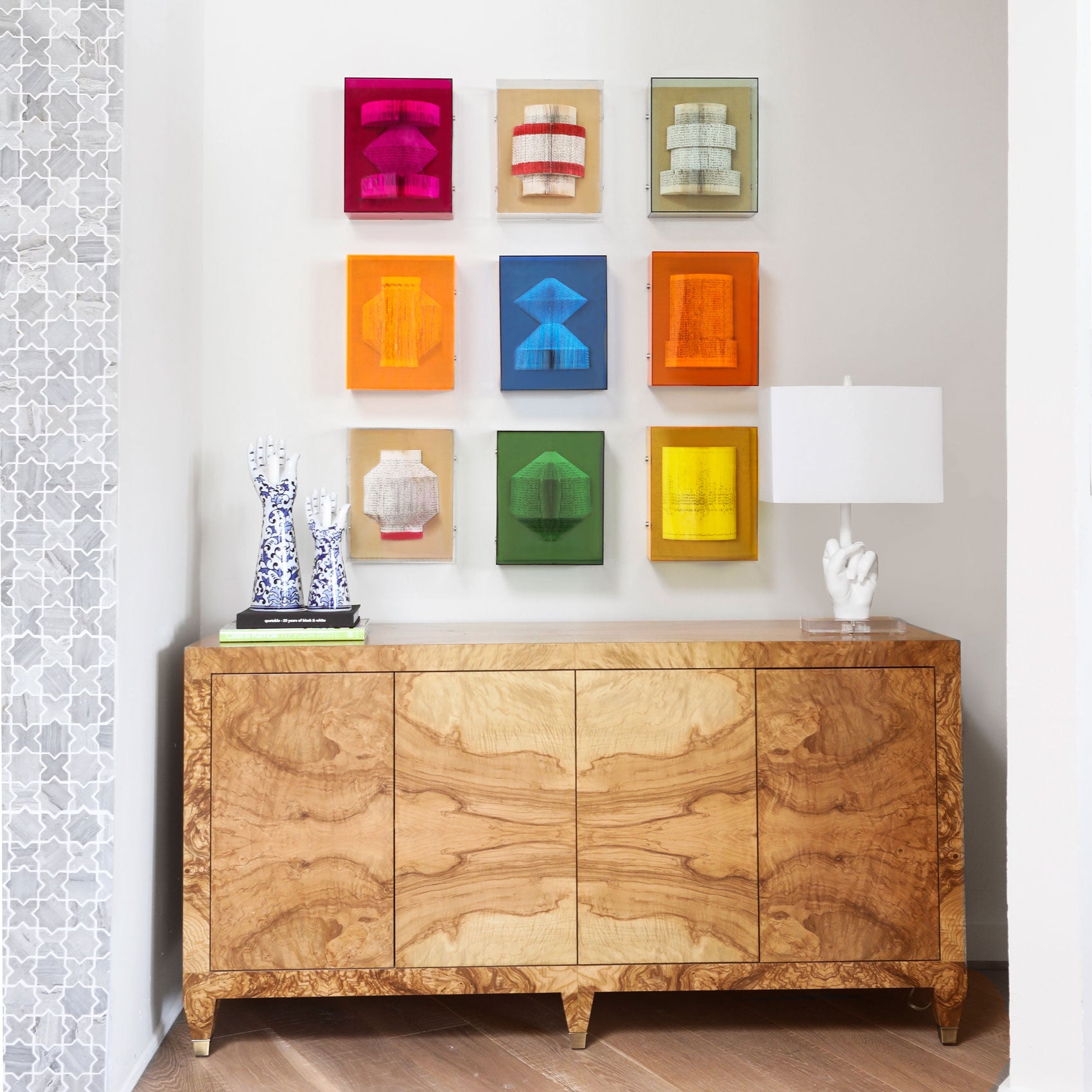
Keeping it minimal atop this credenza means you can go crazy on your walls! For our fellow color enthusiasts, showcasing art from the same set is the perfect way to pack a punch and make a statement.


